
Icon edit
I lead a project aimed at standardizing the styling of icons to enhance user experience. Icons play a crucial role as visual cues, aiding users in quickly identifying desired content or functionality. Inconsistencies in icon styling often result in confusion for users. By unifying the styling of icons, we aimed to provide a more intuitive and seamless experience, facilitating easier navigation and interaction within our platform.

OVERVIEW
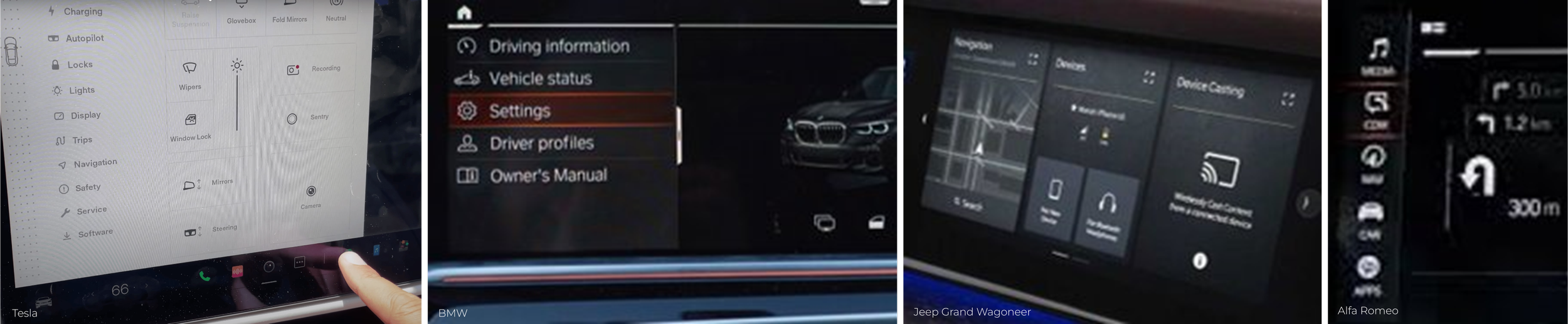
Historically, display icons were developed by different teams at various stages, leading to a lack of uniformity in their design. These icons were typically saved as raster (PNG) files. To transition to the next generation display, it was essential to convert these icons into vector (SVG) format.
The creation of icons over the years was often left to the discretion of individual designers, which contributed to inconsistencies in style and presentation.
Current Display Icons
1500+ unique Icons with lots of overlap/confusion
Color usage inconsistent
Styling usage inconstant
Multiple variations of the same icon
Current Icon Challenges
Not SVG – not Vector Scalable graphics
Need to re-create entire library
Not compatible with Day – Night
Maintaining multiple asset libraries
instance of a single “fuel” icon in a display that has been designed with various styles by different teams.

instance of a single “settings” icon in a display that has been designed with various styles by different teams.

STANDARDS REVIEW
ISO safety symbols have been developed to provide graphical information to ensure proper identification and streamline usability. Additionally, it provides information about the colors of potential optical indicators that alert the driver to either the proper functioning or malfunctioning of the associated devices.


TRENDS OVERVIEW
I conducted a comprehensive analysis of trends within the automotive sector, specifically focusing on the prevalence of black-and-white themes. This examination revealed a significant trend towards the use of black and white elements in various aspects of automotive design and branding. From vehicle exteriors to interior designs and branding materials, the minimalist aesthetic of black and white has become increasingly popular.
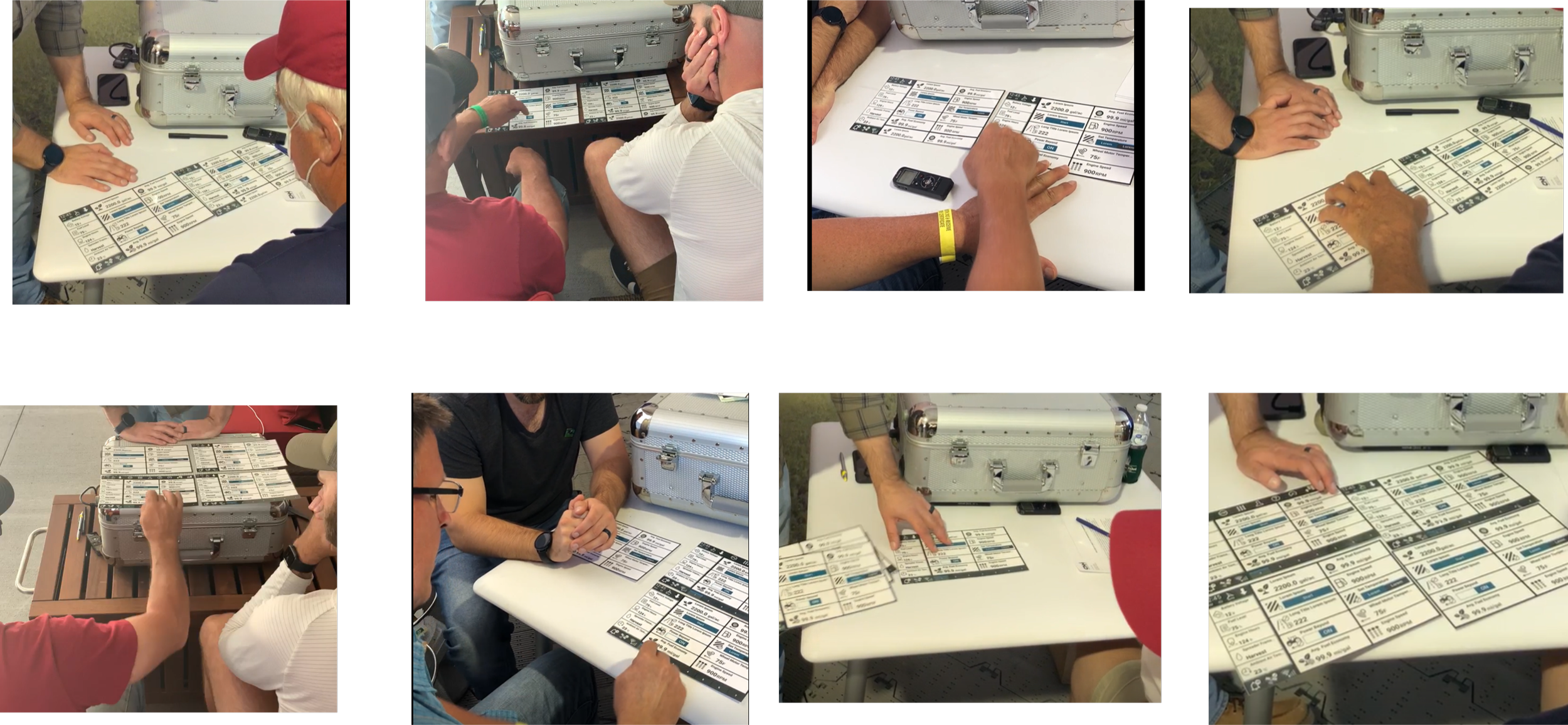
CUSTOMER TESTING
Following are some quotes from the user engagement during the Farm Progress show:
“The black and white color give the user an indication on what the icon means without having to read the description. The coloring is consistent among all the icons. it’s not so busy like to color display.”
“I like this. I like that there is a consistent language of color showing black and white emphasis and other colors are only alerts. - This is super successful in my brain because it allows room for all things to shine. Minimal black and white keeps iconography looking clean and simple - Added color emphasis within the icon clarifies function alert.”
IDENTIFYING STYLE GUIDE
Defined icon design style guidelines including: icon template and boundaries, line weight & space rules, icon design element and design process, including drawing tips for union and applying corners, naming convention, and colors.


ICON LIBRARY
Shared library between Display, Web and Mobile

Vehicle specific display icons
